about More Musing

We are focusing on building a community, bringing the Mortal Muses photographers together, and making the world a bit smaller. On this page, you will find mission: MUSE, muse university and special features.

Saturday, May 7, 2011

muse university - correcting white balance

correcting white balance
a repost by ashley of Ramblings and Photos

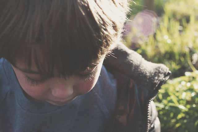
If you follow my blog, I've mentioned that I have an ongoing battle with the lighting in my inlaws' home. In fact, I'll be there this weekend! Although I operate primarily out of Adobe Camera Raw and Photoshop (as well as Photoshop Elements), I wanted to offer some tips that could be applied in any program as it relatest to correcting your white balance in post-processing. First, let's start with a SOOC shot (straight out of the camera).  You might never know it if you only looked at my edited shots, but here is one of the originals: 
IMG_1268 SOOC
How ya like that white balance? Or lack there of. 

Anyways...as I mentioned before, I wanted to start simple....so, I started this edit in Adobe Camera Raw. Regardless of what editing program you're working in, you should have some of the basic functionality that Adobe Camera Raw offers. If you are using Photoshop or Photoshop Elements, you already have ACR (and although I shoot in RAW, you can open  JPG files in ACR by opening PS or PSE - go to File > Open As> Select open as Camera Raw file and select your image). Below, I've copied my SOOC data and the revisions I made in Adobe Camera Raw. Here's what I did:
  • Used AUTO to correct my white balance (it's pulling from the white of my nephew's teeth).
  • Pulled the recovery slider up. 
  • Dropped my blacks a bit.
  • Decreased my brightness.
  • Increased my contrast.
  • Decreased my clarity.
  • Decreased my saturation.
ACR Adjustments
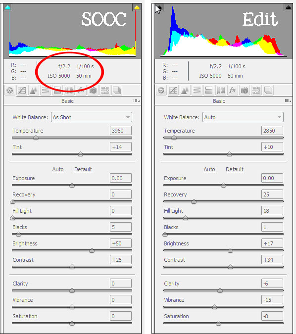
Just making those few adjustments creates a nice clean edit. I've included my edit below. If you're new to editing, I encourage you to try adjusting the exposure, brightness and contrast within your editing program.
IMG_1268 ACR 
I should warn you that most editing programs offer an "Auto" option. Sometimes selecting auto works perfectly but more often than not, you'll need to make some manual adjustments. I'm finding more and more that I use my eye dropper to select an area of the image that is meant to be white, black or gray. In many cases, I'm left with the whites of a person's eyes.

So that was my very basic edit only using Adobe Camera Raw. If you're interested in an advanced edit...keep reading. 
Beyond my edit in Adobe Camera Raw, I brought my photo over to Adobe CS5 (also known as Photoshop). Most of my steps can also be performed in Photoshop Elements. Here are my steps:
  • Created a duplicate of my background. I applied a high pass filter (found under FILTER at the top of the screen). I then applied a soft light blending mode to the layer. This is my #1 favorite trick to make the details of your image pop. You can lower the opacity if needed and/or use a layer mask to erase part of the effect. 
  • Created an adjustment layer - CURVES. In PSE, if you don't have an action curves adjustment, you can download one here (it also includes a mask layer that I use often).
  • Created a new adjustment layer - LEVELS. I pulled the left side (shadows) of the graph to a 11 - this makes my blacks just a tad bit darker. I pulled the middle bar  (mid-tones) up to a 1.11 I often pull the midtones up to a 1.38 to brighten up an image, but that was not necessary here. 
  • Created a new adjustment layer - BRIGHTNESS/CONTRAST. I decreased brightness to -10 and added a contrast of 8. 
  • Created a new adjustment layer - HUE/SATURATION. I find with my computer that I always have to pull back on my yellows and reds (if I want to avoid creating oompa loopmas). 
IMG_1268 Basic Edit
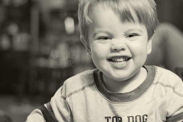
Beyond this point, I felt like my shot looked a little too much like a snapshot (nothing wrong with that, I mean, it is a snapshot), so I decided it needed to be cropped.  I used the same photo ratio to crop the photo. I then made a few more adjustments and created two photo options (I wanted to share both a color and black/white). With my color shot:
  • Created an adjustment layer: BLACK AND WHITE (in Photoshop Elements, you'll want to use a background copy then go to Enhance>Convert to Black and White). I created a custom black and white by playing with the sliders and adding a tint. I also lowered the opacity to 15%.
  • Adjusted my brightness/contrast and levels adjustment layers for a little more drama.
  • Finally, I applied Totally Rad's Lux action at 50%. For a similar effect...you can create a new fill layer - fill it with a shade of cream or light pink, set the blending mode to screen and lower the opacity.
IMG_1268 lux
For my black and white edit, I simply increased my black and white adjustment layer back to 100%.
IMG_1268 BW
So, hopefully that all made sense and you've learned a trick or two. If you want to know more about basic editing techniques, feel free to pop over to my blog. I offer a new editing tutorial every Thursday.
___________________________

repost by ashley of Ramblings and Photos

Join us every weekend for a new muse university post! 
If you would like to provide a post for this series, please contact kat [at] kateyeview.com

Saturday, April 30, 2011

muse university - capture the sky

exploring with a camera: capture the sky
a repost by kat of The Kat Eye View of the World


Welcome to Exploring with a Camera! Today I'm going to talk about capturing the sky. The sky is a subject that I've  been fascinated with over the last few months, and I wanted to share what I've learned through observation. 

What is it about the sky that is so fascinating to me? I think because it is always changing, it is always interesting. The sky is never the same. The weather and clouds, the change in light from the time of day and season, and where you are located all have a dramatic impact on how the sky looks. Not only that, compositional choices, camera settings for exposure and post processing can have a big impact on the final appearance of the sky.

Here are a few things I've noticed...

Big Sky

The image leading this post off is an example of what I call a "big sky" image. Captured on the Oregon Coast in 2008, this wonderful sky has stuck in my mind. Why does the sky feel so big in this image? First, the photo was taken with a wide angle (short focal length), which enables the capture of a lot of space. Second, the horizon is positioned low in the image, so the the sky is dominant. Finally, you can't ignore the effect of the cloud formation. The formation itself leads you into the distance and gives more depth. I want to mention that I did boost the color in this image, to emphasize the blue of the sky.

Here's another big sky image, from the Amalfi Coast of Italy. This image is similar to the Oregon Coast image, not only in subject, but in the focal length, placement of horizon, and interesting cloud formations.


Big sky images don't have to be of nature, they don't even have to have blue sky in them. This image of London is a great example of a big sky in an urban environment. The same elements, wide angle and low horizon, apply to this image as well.


You don't have to have clouds to capture a big sky, that just seems to be what I am drawn to when I capture the sky. I hope some of you will share some cloudless skies in the link tool to provide examples.

Orientation

How you choose to compose your image, horizontal (landscape) or vertical (portrait) orientation, has an impact on the feel of the sky. The image below, of the sky above Mt. Vesuvius in the Bay of Pompeii, emphasizes the height of the sky, rather than the width or expanse as seen in the previous images. The vertical format compresses the depth of the clouds coming toward the viewer to create height.


Here is another vertical example, above the Swiss Alps. I find it interesting how both of these images make the sky and the clouds seem so large compared to the massive mountains. Note that both also use a low horizon, to emphasize the sky.


Contrast

When capturing the sky, I like to have something to provide contrast to the sky itself, something to ground the image and provide a frame of reference. I find I ground my images with a piece of something real, even if I don't include the horizon. The tree in this image of sky from Madrid grounds the image, giving a little bit of context without changing the focal point.


And if you can have an interesting object help ground your sky, why not? This ancient Greek temple in Paestum, on the Amalfi Coast south of Naples, both grounds and provides a point of interest to the fabulous sky on this day.


Contrast that with a slightly wider angle crop, below, and you can see the difference in the focal point of sky versus temple. The sky is still an important feature, but the temple becomes the primary focal point.


Slice of Sky

You don't always have the luxury of having a broad view of the sky to capture. You can create equally interesting sky images by catching a slice of the sky. These images are trickier for exposure, since you have a bright sky behind often significantly darker surroundings. My camera light meter will always choose an exposure in this situation that results in an overexposed sky, so I deliberately underexpose. This will make the foreground darker, but the correct exposure on the sky will make it the focal point.

Here is an image from an early morning walk in Parco di Monza. The slice of sky is the dominant feature in the image, but there is context in the foreground.


The image below comes from an especially frustrating evening walk in Lisbon. I could tell the sky was gorgeous with the clouds and golden light, but I couldn't get anywhere I could capture the broad vista I wanted. There were buildings all around, everywhere I walked. Instead of the big sky, I focused on a slice of sky. I like this image for the subtle details of the city in contrast with that gorgeous sky.


This slice of sky, the view when exiting from a Paris Metro station, gives me an interesting feeling of emerging. The looking-up perspective and escalator provide the context that changes the image from a standard sky shot to something more unique.


Reflections

The sky in reflection is gorgeous. Water reflections are a great tool to expand the impact of the sky in an image. In this image of the Venetian Lagoon, the reflected rays of light and colors of the sky continue the effect of the sky through more of the image. 


Using selective color processing on a reflection of the sky can completely change an image. In this image of my son from 2007, I loved how revealing only the sky in color gave me a feeling of springtime hope and moved the focal point to the sky in reflection.


I like this sky reflection from a modern Vespa for a couple of reasons. First, you can see that it has just rained from the drops on the mirror but the sky is reflected blue - things are clearing up. Second, a modern silver Vespa, while unique if you are from the US, is not all that interesting on its own. This sky reflection provides significantly more interest to the photo.


Backdrop

Finally, I want to explore the sky as a backdrop. Sometimes an image just doesn't work without the backdrop of the sky. It may not be the focal point, but an interesting sky in concert with other elements make a great image. This Parco di Monza sunset image needs both the sky and the tree in silhouette to work.


The focal point in this image is the life boat on the Ferry from Italy to Croatia, but the light in the sky is what makes it interesting. Can you imagine this without that light? I can, and it's not anything special in my mind's eye.


I have taken lots of images of church steeples and domes and monuments, and I can tell you this: the sky makes or breaks the shot. This evening sky in Split, Croatia makes all the difference between a ho-hum church steeple and a marvelous evening shot.


So, what skies attract you? Is it cloudless skies of blue? Stormy, threatening skies? Whatever the sky, go capture it!


___________________________


Join us every weekend for a new muse university post! 
If you would like to provide a post for this series, please contact kat [at] kateyeview.com

Saturday, April 23, 2011

muse university - spirals

exploring with a camera: reflections in glass
a repost by kat of The Kat Eye View of the World


Spirals are a beautiful shape. They have marvelous curves and convey energy and motion. Not only that, they are a truly efficient form used in nature, and we see them so many places in our every day lives!

While I have captured spirals with my camera countless times, the first place I truly became aware of the spiral form explicitly was in the Barcelona Science Museum. The exhibit on forms found in nature had this to say:
The spiral is a circumference that twists away on the plane that contains it. It is the best way of growing without occupying too much space. It is frequently found in animals when there exists the contradictory need for something massive, voluminous, broad or long that does not affect mobility (horns, tails, tongues, trunks, shells, etc.) and in plants to grow something that will subsequently be unrolled. If we unrolled all the spirals we have at home (kitchen and toilet paper, audio and video tapes, adhesive tape, records, springs....) we would be forced to leave the house, as we would not all fit.
Wow! I had never thought of it that way. The typical form in nature that comes to mind for me is the shell (above, from Barcelona Science Museum), but there are so many other places you will see it. Take this photo of a gardenia, for example, from my online friend Barbara:


So gorgeous! Mother nature really knows what she is doing in these things (and so does Barbara). :)

Our man-made world copies nature to use the function of spirals. I don't personally have any photos of toilet paper, but the common spiral staircase, like this one in Verona, is a good example.


And I will spare you the countless spiral staircase photos I have of lighthouses on the Oregon coast! I can't step into one without capturing the wonderful curves and lines of them. (In prepping for this post I learned that technically, this is not a spiral because it is not all on the same plane - it's a helix. But you'll forgive me if I claim artistic license here, won't you?)

Even more than function, humans copy the form of spirals in our everyday world. The Romans used them, as I discovered in this floor mosaic in the British Museum:


The Greeks used them, in their ionic columns. (Thanks to my 9-year-old son, I've relearned which columns are Doric, Ionic and Corinthian. Ionic have the spirals.) These columns are used all over in architecture, here's just one example I caught in Bath:


And they are used all the time in wrought iron work, as I've noticed here in my travels in Europe. Here's a light post in Bath:


My favorite wrought iron spiral of all time is this railing in Amsterdam. Talk about function following form! What graceful curves...


An architect who used spirals over and over in his work was Antoni Gaudí, in Barcelona. He took much of his inspiration from nature, and this ceiling detail is but one example.


We see spirals every day, even if you haven't noticed it lately. I captured these two images of bus shelter advertisements in different cities on our recent trip to England. Spirals are used in graphic arts to denote natural beauty and to convey energy. They catch your eye and draw you in.


Keep your eye out for spirals around you. Here are a few ideas:

1. Look at home. All of those rolls of paper! And then there are spiral notebooks, springs, even toys (hello, Slinky!). What is there with spirals, sitting right next to you?

2. Look at nature. Flowers, ferns, vines, shells all show spirals. Water moves in spirals, think whirlpools and breaking waves. How can you capture them? What else can you find?

3. Look at architecture. Staircases and wrought iron are two I've mentioned, what others do you see?

4. Look at art and design. Artist have used spirals in their work for thousands of years, and the golden spiral or golden ratio is a fundamental compositional principle (see a short and helpful explanation here). What traditional and modern uses of spirals can you find?
___________________________

repost by kat

Join us every weekend for a new muse university post! 
If you would like to provide a post for this series, please contact kat [at] kateyeview.com

Saturday, April 16, 2011

muse university - flare

flare
by muse kirstin

I must confess that I am a flare addict. I love flare just because it is so ethereal, so difficult to capture, so fleeting and otherworldly. I love it that my children know that when the sun is out and low that I will be out there taking photos, pointing my camera towards the sun to try and capture some flare. They love to shout "FLARE" at me while I take them. We all whisper "flare" to one another in the cinema when we spot a flare shot. I hope I have passed on some of my love of flare to my kids. And I hope I can get you out there taking flare shots too.

Fence, flare...and feet!

The most important ingredient for capturing lens flare is sun. And it needs to be low, ideally. And of course, since lens flare is a lens fault, you need to use a lens with lots of elements and preferably not a prime. This is when your kit lens can really make itself useful.


eyelashes

Metering on the subject, you then point the camera at the sun or catch a few rays from the side, and tilt it so that light scatters within the lens elements to make the flare. I sometimes use my viewfinder as it's easier to see what's going on but always make sure not to look directly at the sun.

To get big arcs of flare, open the aperture.

For you Vikki x

More recently I've been playing with getting flare to drip across the picture by using a smaller aperture.

fence in the woods


I love knowing what kind of flare each of my lenses can produce. Have a play and see what you fancy! Maybe you too can become a flare addict.

___________________________

by kirstin of fleeting moments

Join us every weekend for a new muse university post! 
If you would like to provide a post for this series, please contact kat [at] kateyeview.com

Saturday, April 9, 2011

muse university - orton effect

The Orton Effect—how to do it, where to use it
By guest Gilly Walker


The Orton Effect is named after photographer Michael Orton, who developed a technique of sandwiching together two images he’d shot on film – the images were identical except that one was sharp and one out of focus. Although Orton was using film, the effect is even easier to create in Photoshop or any other digital imaging software that allows you to use layers.

It has the effect of intensifying colours and giving a dreamy, ethereal look; I often think it resembles those old-fashioned postcards where the colours don’t look quite real and bleed a little at the edges.

There are lots of variations on how to do it, and if you Google ‘Orton effect’ you’ll find them, but this is the method I use. Instructions are for Photoshop Elements 6, but should be easy enough to adjust for other versions of Photoshop or Elements. I’m assuming a little bit of basic Photoshop knowledge here.

Here’s our starting image:


Method One
  1. Open your image and make any necessary adjustments until it looks the way you want it
  2. Duplicate the background layer twice (either right-click on the background layer, then Duplicate Layer, or click Layer, Duplicate Layer in the menu at the top of the screen). Call the first layer Sharp and the second one Blur.
  3. Click on the layer immediately above the background layer (Sharp) and change the blending mode to Screen.
  4. Click on the second duplicate layer (Blur)—it should be the one at the top of the stack.
  5. Go to the Filter menu, and choose Blur, then Gaussian Blur. The amount of blur you need to apply will vary with the resolution of your image and the effect you want to achieve—for an image 600 pix-els across, you may only need about 5-6, but for a large image you might have to go up to 35-40 or even more. You should be aiming to use enough blur to keep the shapes and outlines clearly visible but to lose most of the detail.
  6. When you’ve applied the blur, change the blending mode of this layer to Multiply. Other options than can work are Soft Light, Hard Light and Overlay—I find Multiply usually works best but give them all a try. Your screen should now look something like this:


The final image is often a bit too dark. To fix this you can either increase the transparency of the top layer a little, or adjust it using Levels or Curves.

Compare the original image with the Ortonised one:


Method Two


There’s a variation on this technique that also works well:

  1. Open your image and make any necessary adjustments until it looks the way you want it
  2. Duplicate the background layer and change the blending mode to Screen.
  3. Click Layer in the menu, then Merge Down to make these two layers into one
  4. Now duplicate the resulting layer and add Gaussian Blur as before. Change the blending mode to Multiply. Adjust the transparency, Levels or Curves as necessary.

You can compare these two methods below - in this example there’s not a huge amount of difference. (the first image uses the first method, and the second uses the method just given)


However, with other images there will be a much more noticeable difference between the two:


As you can see, the second method gives a lighter result, but the colours are not so intense.

The Orton technique doesn’t work on everything. I find the best subjects are landscapes, nature and anything that has a kind of timeless or retro look to it anyhow. It often looks all wrong on anything sharp-edged and modern. It’s also very easy to overdo, ending up with something garishly coloured and cartoon-like; it’s usually at its best when used subtly.

To a certain extent, you can use it to save an image that’s not quite in focus, although there are limits to how well this will work. It’s best to start by sharpening the original as much as you can without making it look over-sharpened.

I’ve also seen it used on portraits to good effect, although I haven’t tried this myself. It’s particularly good for portraits of children, as it smoothes out skin tones and gives a subtle glow. It tends to work well, too, for anything with coloured lights in it, like Christmas lights for example. It can give a lit-up Christmas tree a really magical effect.

Although the way it enhances colours is one good reason for using it, it can also be applied to black and white images for its dreamy, fairytale look.


Something else you can try is to convert the Blur layer to black and white; this gives a different effect again, with the colours becoming softer and more pastel—a bit vintage in style. (It works best where there isn’t too much strong colour originally.) You will probably need to reduce the transparency of the black and white layer a little to allow more of the colour to show through. In the example below, it works to emphasise the graphic elements of the picture.


Until recently, I hadn’t thought of using it in combination with a Lensbaby; I assumed there would be alto-gether too much blur to make it workable. However, I played around one day and found that It actually works very well – the Lensbaby effect is very dreamy and soft-focus anyway and I don’t think Orton on top of it adds much more blur to the mix, but it does enhance the colours quite a bit and gives a very painterly look, as you can see in the two examples below:


Finally, you don’t have to retain the Orton effect over the whole picture: another option is to use the Eraser tool (or a layer mask in Photoshop) to remove the effect in some parts of the image while leaving it in others.

If you want to know a little more about Michael Orton and see some galleries of his work, get hold of his book ‘Photographing Creative Landscapes’ - available on Amazon. (Note: this is not just about the above technique—he uses a variety of methods to produce impressionistic landscapes) Another photographer who is known for using this method is Andre Gallant; his website is here and has some stunning images on it.

Hope you have fun trying out this technique, and it would be great to see what you come up with!
___________________________

post by Gilly Walker
Flickr—GillyinKent


Join us every weekend for a new muse university post! 
If you would like to provide a post for this series, please contact kat [at] kateyeview.com

Wednesday, April 6, 2011

* muse flash *

Would you like to be a Mortal Muses sponsor?

Advertise your blog, website, product, or e-course on all four Mortal Muses pages for one low price. We are more than a blog. We are a community of 1500+ photographers and growing!.  Give us a way to find you and all you have to offer!

You can start the process by selecting a PayPal option for the length of your ad run.  You do not have to have a PayPal account to use the service.  You can even use your credit card to pay the PayPal invoice.  Upon confirmation of your payment, send us an email to mortalmuses@yahoo.com  with the 150 X 150 image you would like to use. We accept .jpg or .gif files.

Make sure to send a short bio with links in the email. Monthly, we will be doing *Museflash* for sponsors.  If you would like to provide a giveaway for a theme or as part of a *Museflash*, feel free.  We will be tweeting, facebooking, and promoting. 

Do you need help creating the button?


For only $10 USD, we will create  it for you. You may also use it on your personal site or other blogs. 

Options


Please note:  All Mortal Muses advertisers are subject to approval.  We want to make sure the products and websites advertised are a fit with the Mortal Muses community.

Saturday, April 2, 2011

muse university - reflections in glass

exploring with a camera: reflections in glass
a repost by kat of The Kat Eye View of the World

Today we're looking at capturing images with Reflections in Glass. Reflections in glass are so cool because the image you see is not a direct image of a subject. What's behind and around the glass changes the images, and the reflection itself often softens and distorts the subject.

Below is an example from a visit to Lucerne, Switzerland. In this image, the only "direct" image you are seeing is straight through the walkway. The rest of the arches and store windows are reflections. See the people on the right? They are really on the left, not directly visible to the camera, but in the reflection they have a "ghost image" quality. It's like an optical illusion, but it's just looking down a corridor lined with glass.


To get this image I moved around and took photos from several different angles and at different times with varying amounts of people. When I took this specific shot, I didn't even notice the people visible in the reflection on the right because I was focusing on the "direct" part of the image being free of people.


Here is another example, of my son looking out of a train window. The reflection draws your eye to his profile. Look at it for a while and you start to see the symmetric shape between the two profiles. You'll also notice that the key areas of his face in the reflection - eyes, nose, lips - are clearly visible while the other parts are modified by what is seen out the window.


If there is something immediately behind the glass, you can get really cool effects in your reflections. The security door immediately behind the glass in this photo enabled me to get an uninterrupted scene of the reflected street in Lucerne but with a really unique texture.


A reflection can completely change a setting. Without the reflection of me and my family, the image below would be just another doorway to a modern building. Nothing of note that I would routinely photograph. With the reflection, it becomes a family portrait with a sense of place - you can see the wording above the door is in Spanish (we were in Barcelona) and the funky tube things draped across the top show part of the science museum we were entering. Notice how everything in the photograph seems to draw your eye to the center, where the reflection is. Also notice also the cool "double" effect with our reflections because the entrance had two sets of glass doors.


Here is another reflection of an entrance, a self-portrait of me at our apartment building in Italy. I love the sense of place that is achieved by what is reflected in the background, along with the tiny little suggestion of what is behind the door. Not a huge fan of my pictures of myself (who is?), I also like how the reflection softens my image so that I don't focus on all of the things I immediately see as "flaws" in a regular photograph. Maybe I'm able to better see the real me, as others see me, because it's a reflection.


And, just a reminder, glass is just not windows and doors! Here is a wine bottle, but in it there is a reflection of me and my family along with the buildings across the street in Nice, France. The subject here is the bottle, but the reflection adds interest.


Tips for getting your own images of reflections in glass:

1. Look for indirect light on both sides of the reflection. In reviewing pictures for this topic I realized that the most interesting reflections have indirect light as the main light source - either in shade or cloudy day or evening light. When there is a direct or strong light source on either side of the glass you will not get the kind of reflections I'm showing here.

2. Look in and Look out. Keep you eye out for reflections on both sides of the glass, whether you are indoors or outdoors. When you see the reflection, also notice what you see through the reflection. That can make or break the image! It's easy to focus so much on the reflection that you don't see something distracting on the other side.

3. Change your perspective. If you see a cool reflection, move around and photograph it from different perspectives and compositions. Because of the way you can often see what's on both side of the glass, you may find a more interesting composition, or even a different reflection, if you move a few steps to the left or right than where you first noticed the reflection.

4. Look for reflections in all kinds of glass - not just windows. When you start to see these, you will notice that glass is everywhere, in all shapes and sizes and colors.

Have fun seeing all of the reflections in glass around you in a whole new way!

___________________________

repost by kat

Join us every weekend for a new muse university post! 
If you would like to provide a post for this series, please contact kat [at] kateyeview.com