
The Orton Effect—how to do it, where to use it
By guest Gilly Walker

It has the effect of intensifying colours and giving a dreamy, ethereal look; I often think it resembles those old-fashioned postcards where the colours don’t look quite real and bleed a little at the edges.
There are lots of variations on how to do it, and if you Google ‘Orton effect’ you’ll find them, but this is the method I use. Instructions are for Photoshop Elements 6, but should be easy enough to adjust for other versions of Photoshop or Elements. I’m assuming a little bit of basic Photoshop knowledge here.
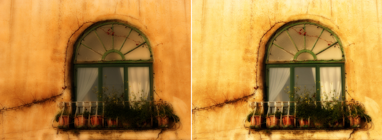
Here’s our starting image:

Method One
- Open your image and make any necessary adjustments until it looks the way you want it
- Duplicate the background layer twice (either right-click on the background layer, then Duplicate Layer, or click Layer, Duplicate Layer in the menu at the top of the screen). Call the first layer Sharp and the second one Blur.
- Click on the layer immediately above the background layer (Sharp) and change the blending mode to Screen.
- Click on the second duplicate layer (Blur)—it should be the one at the top of the stack.
- Go to the Filter menu, and choose Blur, then Gaussian Blur. The amount of blur you need to apply will vary with the resolution of your image and the effect you want to achieve—for an image 600 pix-els across, you may only need about 5-6, but for a large image you might have to go up to 35-40 or even more. You should be aiming to use enough blur to keep the shapes and outlines clearly visible but to lose most of the detail.
- When you’ve applied the blur, change the blending mode of this layer to Multiply. Other options than can work are Soft Light, Hard Light and Overlay—I find Multiply usually works best but give them all a try. Your screen should now look something like this:

The final image is often a bit too dark. To fix this you can either increase the transparency of the top layer a little, or adjust it using Levels or Curves.
Compare the original image with the Ortonised one:

Method Two
There’s a variation on this technique that also works well:
- Open your image and make any necessary adjustments until it looks the way you want it
- Duplicate the background layer and change the blending mode to Screen.
- Click Layer in the menu, then Merge Down to make these two layers into one
- Now duplicate the resulting layer and add Gaussian Blur as before. Change the blending mode to Multiply. Adjust the transparency, Levels or Curves as necessary.
You can compare these two methods below - in this example there’s not a huge amount of difference. (the first image uses the first method, and the second uses the method just given)

However, with other images there will be a much more noticeable difference between the two:
As you can see, the second method gives a lighter result, but the colours are not so intense.
The Orton technique doesn’t work on everything. I find the best subjects are landscapes, nature and anything that has a kind of timeless or retro look to it anyhow. It often looks all wrong on anything sharp-edged and modern. It’s also very easy to overdo, ending up with something garishly coloured and cartoon-like; it’s usually at its best when used subtly.
To a certain extent, you can use it to save an image that’s not quite in focus, although there are limits to how well this will work. It’s best to start by sharpening the original as much as you can without making it look over-sharpened.
I’ve also seen it used on portraits to good effect, although I haven’t tried this myself. It’s particularly good for portraits of children, as it smoothes out skin tones and gives a subtle glow. It tends to work well, too, for anything with coloured lights in it, like Christmas lights for example. It can give a lit-up Christmas tree a really magical effect.
Although the way it enhances colours is one good reason for using it, it can also be applied to black and white images for its dreamy, fairytale look.

Something else you can try is to convert the Blur layer to black and white; this gives a different effect again, with the colours becoming softer and more pastel—a bit vintage in style. (It works best where there isn’t too much strong colour originally.) You will probably need to reduce the transparency of the black and white layer a little to allow more of the colour to show through. In the example below, it works to emphasise the graphic elements of the picture.

Until recently, I hadn’t thought of using it in combination with a Lensbaby; I assumed there would be alto-gether too much blur to make it workable. However, I played around one day and found that It actually works very well – the Lensbaby effect is very dreamy and soft-focus anyway and I don’t think Orton on top of it adds much more blur to the mix, but it does enhance the colours quite a bit and gives a very painterly look, as you can see in the two examples below:


Finally, you don’t have to retain the Orton effect over the whole picture: another option is to use the Eraser tool (or a layer mask in Photoshop) to remove the effect in some parts of the image while leaving it in others.
If you want to know a little more about Michael Orton and see some galleries of his work, get hold of his book ‘Photographing Creative Landscapes’ - available on Amazon. (Note: this is not just about the above technique—he uses a variety of methods to produce impressionistic landscapes) Another photographer who is known for using this method is Andre Gallant; his website is here and has some stunning images on it.
Hope you have fun trying out this technique, and it would be great to see what you come up with!
___________________________
post by Gilly Walker
Website—www.gillywalker.com
Flickr—GillyinKent
Join us every weekend for a new muse university post!
If you would like to provide a post for this series, please contact kat [at] kateyeview.com
Great tutorial! I can't wait to give it a try!
ReplyDeleteI am VERY excited to try this. Thank you for sharing this technique.
ReplyDeleteGilly - Thank you for submitting this wonderful post for all to learn from. xo tam
ReplyDeleteThis is great! Im very excited to go and play now ;)
ReplyDeleteThanks!!
wonderful tutorial! i love the orton effect, but was unaware how orton actually created it. as a film lover, i really want to give it a try, naturally!
ReplyDeletecool! interesting tutorial!
ReplyDeletefantastic! thanks for sharing this with us today.
ReplyDeleteOh..I've always wanted to learn this effect. Thank-you for your detailed instructions!
ReplyDeleteThank you for this great tutorial! I've admired the effect before but never thought I'd be able to do it myself. But I'll definitely try it out now!
ReplyDeleteLove the pictures here, especially the first one, it's stunning!
Thanks everyone - I had fun putting it together.
ReplyDeleteAfter finally biting the bullet and replacing our old PSE8 with CS5, I can hardly wait to try out this one! Thanks so much for your tips!
ReplyDeleteRose
Thanks so much for the tutorial! Will have to give it a try!
ReplyDelete